♠ Posted by Emmanuel in Energy
at 11/26/2007 12:45:00 AM
I came across a nifty set of graphics on the Financial Times website on where oil production and consumption are highest and where the largest oil movements take place. It's pretty much self-explanatory. First, here are the world's ten largest oil producers: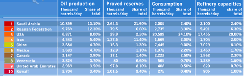
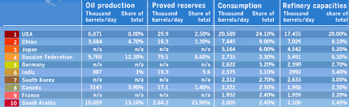
Next, here are the world's ten largest oil consumers:
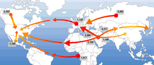
Finally, here is a map indicating the largest movements of oil in terms of thousands of barrels a day: